
 TL;DR:
To establish a specific emotional mood through color grading, photographers must balance stylistic tonal adjustments with realistic skin tones, utilizing base edits or Look-Up Tables (LUTs) to maintain visual consistency across mixed lighting conditions.
● Select grading styles based on the scene's conditions: warm tones suit romantic sunset portraits, cool tones enhance cinematic drama, vintage softens contrast for rustic settings, and modern clean grading preserves accurate whites for contemporary editorial shoots.
● Accelerate editing workflows by applying presets for a consistent baseline across a series, but manually fine-tune exposure and saturation on individual photos to prevent unnatural over-grading and correct color shifts between natural sunlight and indoor artificial light.
● For automated structural and tonal alterations, the Repairit App on iOS and Android utilizes an AI text-to-edit feature that processes typed prompts to instantly modify backgrounds, remove objects, and apply targeted color palettes to files including RAW formats.
Ask AI for a summary
 ChatGPT
 Perplexity
 Gemini
 Claude
 Grok
Grok
Your photos take one of the special moments of life, but even the best shots can look monotonous without color grading. Colour grading photography is the process of color adjustment to establish the mood or aesthetic of your photographs. It is something more than brightness or contrast adjustment. Rather, it gives your images a certain tone and overall feeling. This tutorial includes essential techniques, common styles, and professional tips to make every photograph remarkable. Wedding editing tips are also included. Read on for more.
Table of Contents
Part 1. What is Color Grading in Photography?
Color grading in photography is the process of evolving and changing a photo to reflect the look and mood you want the photograph to convey. It involves making adjustments to brightness, contrast, saturation, and tones of a photo to produce images that have a cohesive and appealing look.
Applications such as Lightroom allow you to make this process easier with sliders, filters, and preset settings that help fine-tune colors:
- Warm colors (red, yellow, orange) express happy and intimate feelings.
- Cool tones (blue, green) exhibit a calm and relaxed feeling.
- Neutral tones (white, gray) express a clean and elegant feeling.
The aim of color grading is to achieve a cohesive appearance that corresponds to the mood of the photo or the story you want to tell. You can use color grading to alter your photos so they appear warmer, cooler, or a softer mood.
Part 2. Why Color Grading Matters for Photographers
One of the solutions in photo-editing is color grading. Color grading involves selecting colors that set a mood or the style of the images you create. It allows photographers to instill emotion, balance, and personality into their work. Here's where color grading matters:
- It tells a story with emotion. Warm tones create a cozy, happy feel. Cool tones make the scene serene or slightly sad.
- It improves the composition of the photo. When the colors are changed, it allows the photographer to emphasize the area that they want the viewer to see, providing more "pop".
- It fosters consistency between images. A common color scheme establishes a color identity for the individual or their brand.
Part 3. Popular Color Grading Styles in Photography
Color grading gives relevance to your photos. The way you change the colors can transform an ordinary snapshot into something else. Here are some common styles photographers often use:
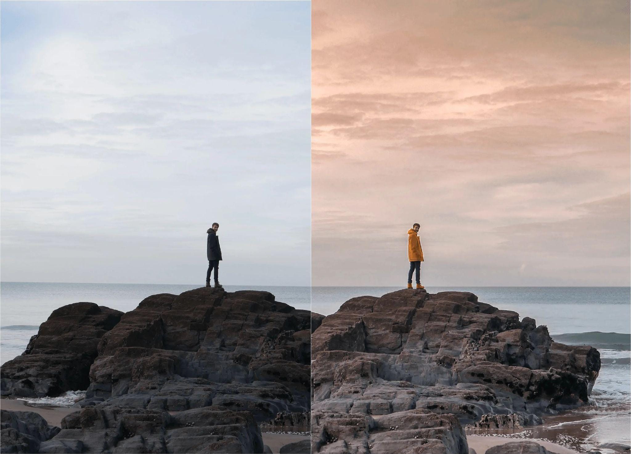
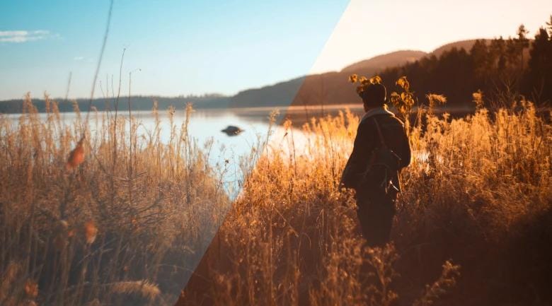
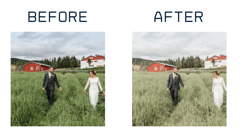
Warm Tones for Emotional Impact
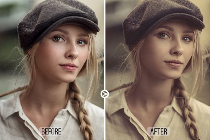
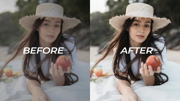
Soft hues of gold, orange, and red give warmth and intimacy to your images. Think about using warm tones for romantic wedding photography or sunset portraits.
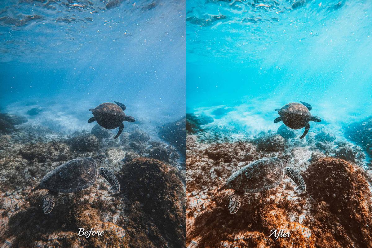
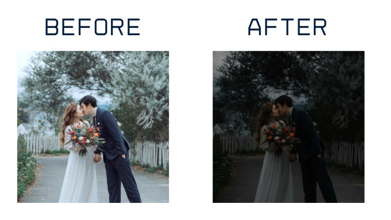
Cool Tones for Dramatic Looks
Blues and greens give calmness to your images, creating a cinematic and emotional impact along the way. Cool tones are ideal for outdoor scenes, moody indoor scenes, or rainy day portraits as well.
Vintage/Film-Inspired Grading
This style creates a nostalgic and dreamy feel for your photos. Colors are slightly point-like, softer contrast, with a touch of grain, as if they came from an old photo album. This style is ideal for rustic-type weddings or for outdoor photo sessions filled with good natural light.
Modern Clean Grading
If you prefer a bright and natural look, then this style is perfect for you. Whites stay beautiful, and skin tones appear natural, with each detail holding good balance. Modern clean grading style is commonly used for contemporary wedding photography, lifestyle and editorial sessions.
Part 4. Color Grading Wedding Photos for Stunning Results
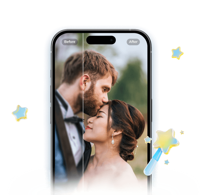
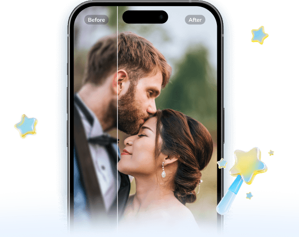
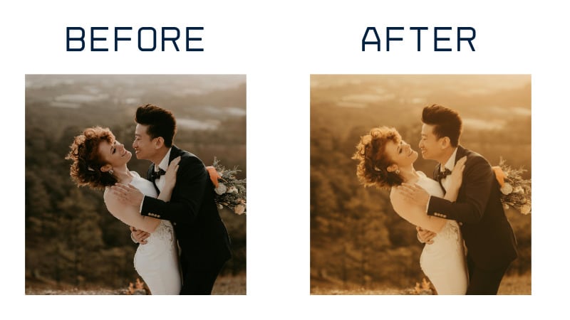
Weddings are full of emotions, lights and color, which are perfect to experiment with creative color grading for your wedding images. Wedding shots often have mixed lighting to manage and balance, from bright and airy outdoor scenes to dark indoor receptions. Color grading makes these differences smoother in color, adds mood, and keeps skin tones looking natural. Color grading can also give your entire wedding album a consistent, natural look.
To see how color grading can change your wedding photos, try the Repairit App. The tool sharpens details, enhances colors, and overall polishes your wedding images. You can do this manually or use the new text-to-image feature as well. Simply type your prompt, your device will prompt you with the text to an image, and the app delivers high-resolution images.
Key Features:
Repairit Al Photo Enhancer
Edit Photos with Words, Create Magic with Al
 Text-to-Edit: Describe it, AI repairs, enhances & colorizes instantly.
-
Memory Revival: Restore old photos, fix scratches & blur, relive details.
-
Creative Freedom: Remove objects & turn ordinary shots into unique stories.
-
Universal Recovery: Rescue corrupted photos from 2,000+ devices & RAW formats, all securely processed.
Step-by-Step Guide:
Step 1: Install Repairit on your Android/iOS device. Choose Text to Edit and upload your wedding photo.
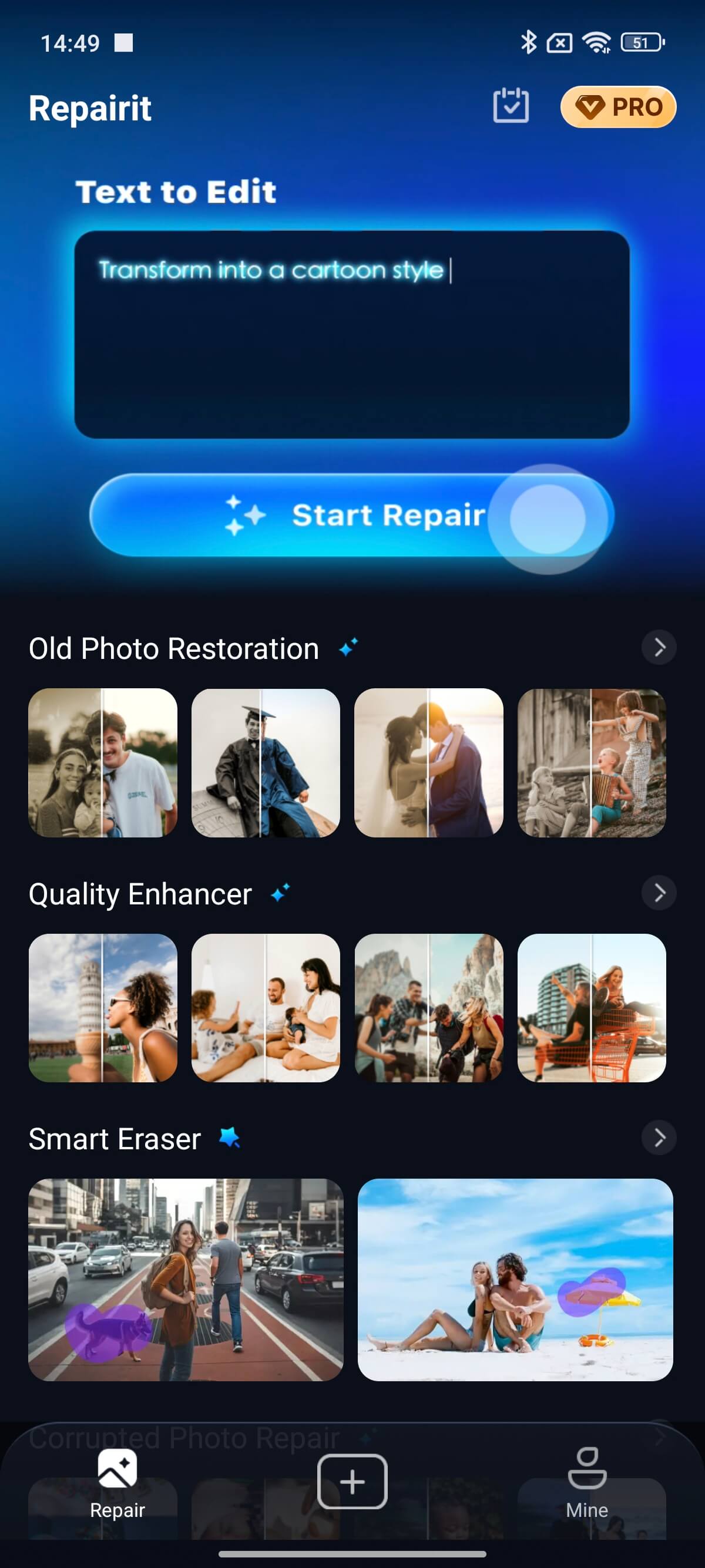
Step 2: Select a pre-made prompt or type a prompt:
- Change the wedding photo's background to sunset.
- Remove people or scratches from the wedding venue.
- Change the wedding dress to a wedding gown.
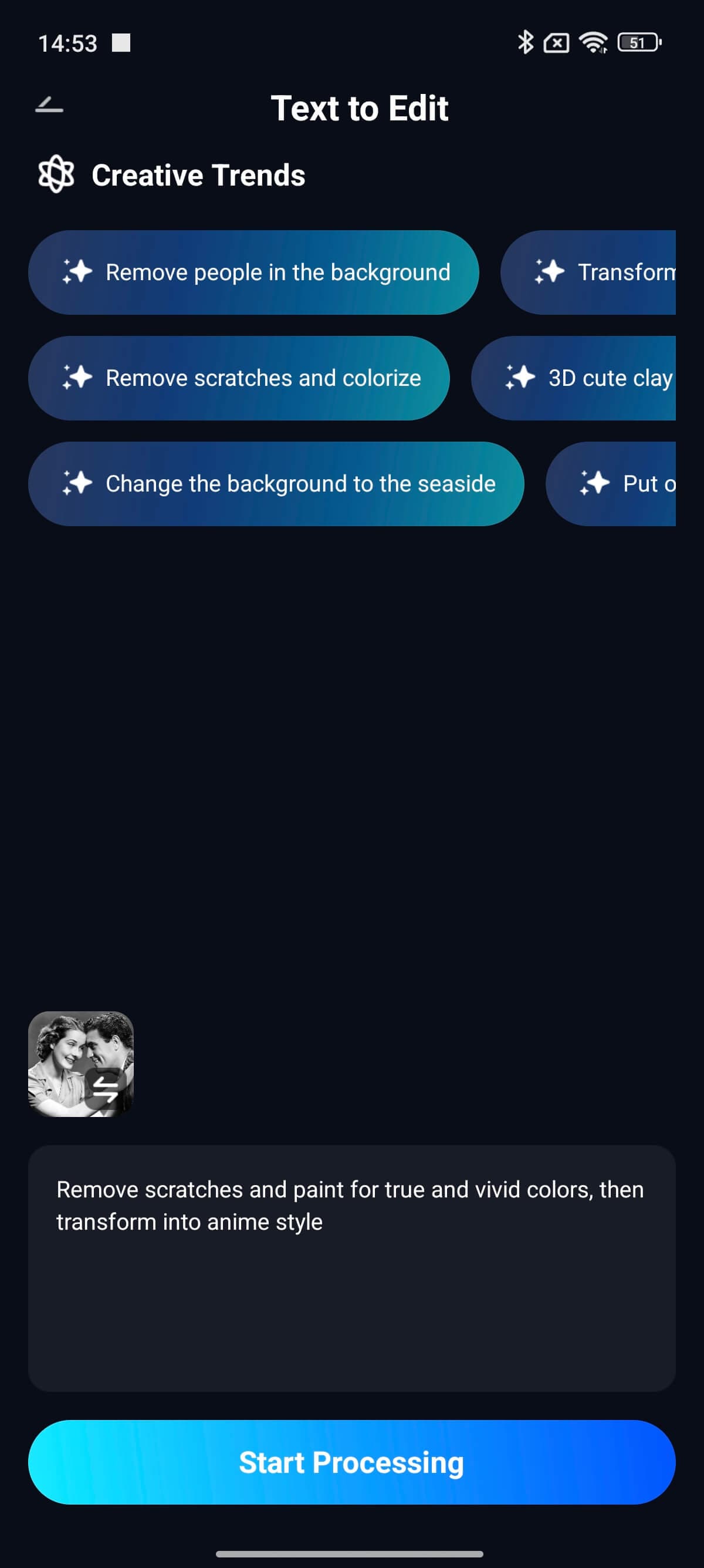
Select Start Processing, and the AI will make your new wedding photo instantly.
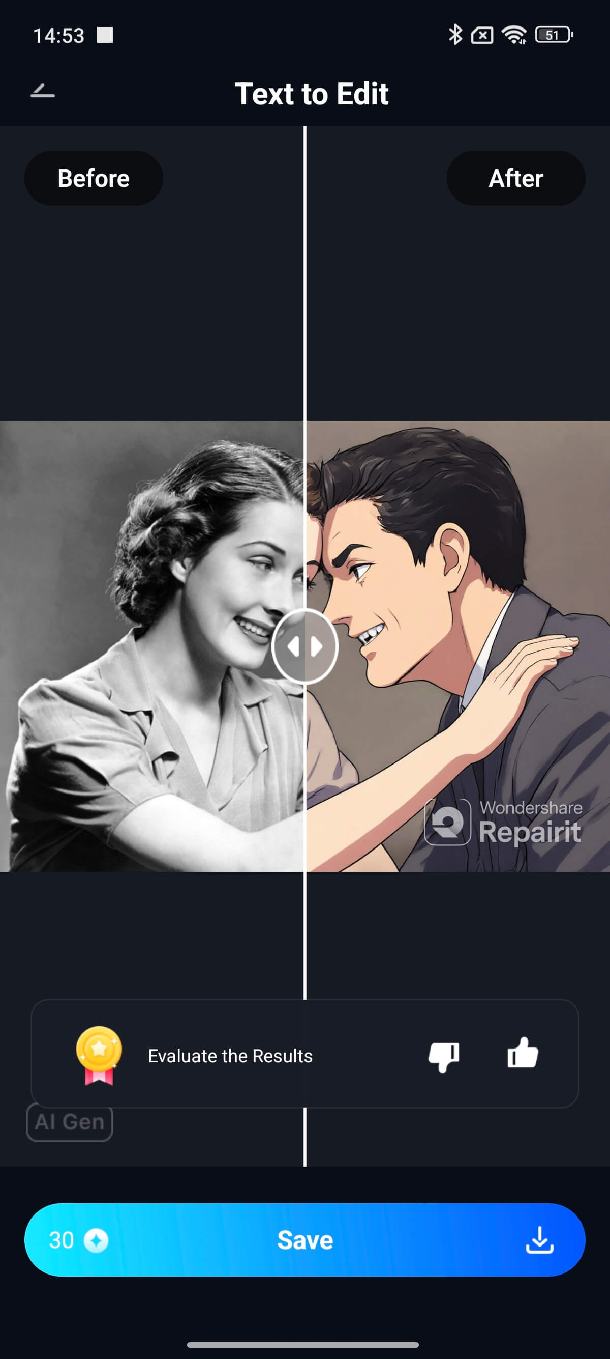
Step 3: Look at the color-graded wedding photo and adjust as necessary. Select Save to download your edited wedding photo.
You can try these popular styles using the Repairit app:
Timeless Warm
Prompt: Change the whole mood of the photo to soft golden tones to add warmth and love.
Pastel Romantic
Prompt: Color grade the photo. Add light, airy colors for a dreamy and elegant feel.
Moody Tones
Prompt: Color grade the photo. Add dark shadows for a dramatic and emotional look.
Part 5. Essential Tips for Beginners in Color Grading for Photography
Getting started with color grading for photography can feel overwhelming, but mastering it is key to giving your photos a professional and emotional touch. Here are some beginner-friendly tips to help you improve your photo color grading workflow and achieve consistent, high-quality results.
1. Start with Presets but Customize Them
Presets are a great foundation when learning color grading in photography. They offer a quick starting point and help you understand how color tones, contrast, and brightness interact. Apply a preset that fits your creative vision, then fine-tune exposure, saturation, and highlights until the photo feels balanced and authentic to your style.
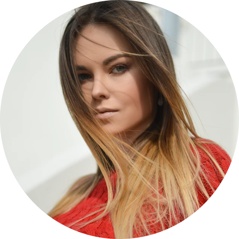
2. Prioritize Natural Skin Tones
In portrait, fashion, or wedding photography, skin tones can make or break an image. Keep them realistic — avoid overly red, orange, or pale hues. Subtle warmth with accurate tones enhances natural beauty and keeps your subject engaging without looking over-edited.
3. Experiment with Different Lighting Conditions
Lighting dramatically influences color perception. Practice grading images shot in various lighting scenarios — sunlight, shade, and indoor artificial light. Notice how tones shift with each setting, and adjust your color grading techniques accordingly. This will help you develop an intuitive sense of tone and balance.
4. Maintain Consistency Across a Photo Series
Consistency is critical in color grading for photography, especially for events like weddings or product shoots. Use the same base adjustments or LUTs (Look-Up Tables) to ensure all images in a set share a cohesive look and mood. A consistent color palette reinforces your brand’s visual identity and professionalism.
5. Keep It Subtle and Realistic
Less is often more. Over-grading can lead to unnatural colors and distracting visuals. Aim for subtle color grading that enhances rather than overpowers the original photo. Professional photographers rely on clean, balanced tones that preserve details and emotions while improving overall impact.
Conclusion
Color grading in photography goes beyond regular editing. It provides a certain feel to your wedding photos that makes them feel more alive and meaningful. You can use warm tones for a romantic feel or soft colors for a dreamy feel. It's time-consuming to learn, but once you practice, you'll start developing a good eye for color, mood, and balance.
FAQs
-
How does color grading change the overall mood of wedding photos?
Color grading determines how the viewer will feel when looking at your wedding photos. Warm-toned photos can feel more romantic and happy when viewed, while cooler-toned photo editing can create a calm, dramatic, or cinematic feel. -
What's the difference between presets color grading and manual color grading?
Color grading presets color grading add a one-click color style to your images. This method is quick and creates a consistent result, which is ideal for a short editing cycle. Manual color grading allows you to experiment with the contrast's tone and saturation of each photo image for a more personal style. -
Are there beginner methods in color grading photography online?
Yes, there are beginner online tools to try easy color grading for photography. Online tools like Lightroom or Canva are great for this, where there are easy-to-use sliders, presets, and filters for fast and easy color grading for amazing results without advanced skills.