
 TL;DR:
Recreating Wes Anderson's nostalgic, symmetrical visual style requires restricting your palette to 3-5 complementary pastel colors, flattening contrast, and assigning specific warm or muted hues to narrative emotions.
● For precise manual video editing, use Premiere Pro's Lumetri Color panel alongside a reference clip, specifically utilizing HSL Secondary to isolate skin tones and adding a Film Grain overlay set to Screen blending mode to achieve a flat cinematic look.
● Photographers seeking an automated workflow can use the Repairit App's AI Text-to-Edit feature by typing prompts like "vintage Wes Anderson palette" to instantly apply the signature soft lighting, pastel hues, and symmetry adjustments without manual color wheels.
● A crucial prerequisite for establishing this cohesive aesthetic across multiple scenes is applying standardized LUTs to maintain tonal continuity while intentionally avoiding bright, harsh saturations in favor of soft, vintage warmth.
Ask AI for a summary
 ChatGPT
 Perplexity
 Gemini
 Claude
 Grok
Grok
Wes Anderson is known for his movie precision. He has a quirky storytelling style and a visual language that everyone knows instantly. Not surprisingly, a large part of the style is color. Anderson's desire to create beautiful scenes with color palettes also informs the narrative, mood, and emotion of each moment in the movie.
Anderson uses pastel colors, warm tones, and bold contrasts to create worlds that appear to be dreamlike or nostalgic. The guide will explain Wes Anderson color grading, showcase color palettes from some of his films, and suggest ways to recreate it to your edits.
Table of Contents
Part 1. What is Wes Anderson Color Grading?
Wes Anderson color grading can be summed up with two simple words: direct directing. Everything is done with intention. Every frame, color, and camera movement is meant to feel direct.
Movies created in the style of Wes Anderson have a whimsical nature that can feel detailed and chaotic at the same time. Also, every visual element, prop, or movements are designed to make you notice exactly what he wants you to see. Anderson controls every aspect of the viewing experience.
- You know what he wants you to know.
- You see what he wants you to see.
- You feel what he wants you to feel.
Anderson's style is clear, charming and heartfelt. Rather than focusing on important details, the drama and comedy of his films often play with a certain level of transparency. You are invited into Anderson's world purposefully and gracefully. This method helps to create engaging, nostalgic, and deeply empathic human characters that Anderson gives life to.
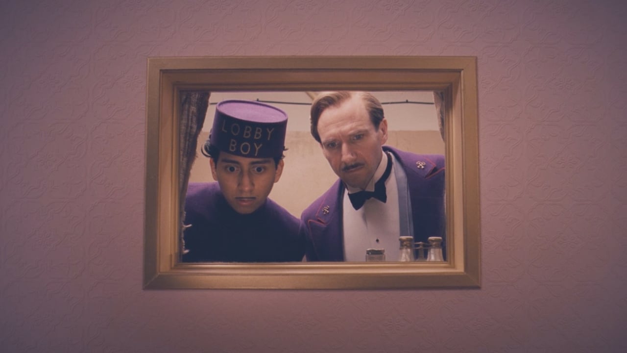
The Grand Budapest Hotel is a superb example of this. Every frame in the film is symmetrical. Every movement is consequential, and even the slightest movement occurring in a background long shot is meaningful and humorous.
Ultimately, Wes Anderson's visual language speaks to his own character: imaginative, disciplined, and nostalgic. Whimsical as his films may be, everything feels crafted. You can notice it from the costumes to the set design, to the scripted dialogue, and even the scored music. Nothing ever feels nonsensical as everything is connected.
Part 2. Key Elements of Wes Anderson’s Visual Style
Wes Anderson's films are easily recognizable through specific visual styles, which have been developed for all of his films. This also creates a deliberate atmosphere to each of his shots and frames toward directing your attention to where Anderson wants you to focus.
1. Symmetry
Symmetry (or balance) is an established hallmark of Anderson's style. Most of his shots have been centered and utilize perfect balance, which creates total symmetry. This creates a sense of balance and highlights a character, object, or location. This idea can be observed in Anderson's first film, Bottlerocket (1996).
2. Tableau Compositions
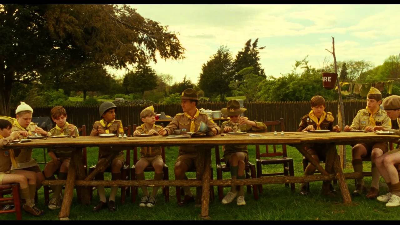
Every scene in a Wes Anderson film also feels as though you are reviewing a painting or a work of art. His consistent symmetry creates a sense of tableau within each of his shots and sequences. These are occasionally located in iconic works of art like Moonrise Kingdom (2012) with Nathan Zurcher's share in nod to Davinci's The Last Supper.
3. Color
The color also creates a tone of each of the Anderson films, while using a consistent and deliberate color palette:
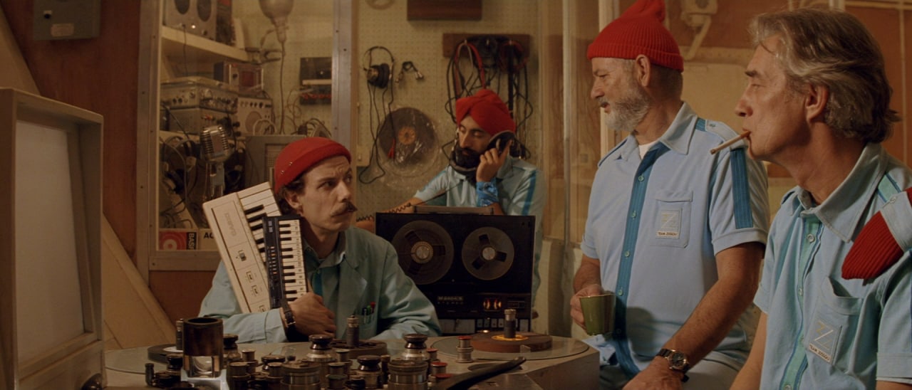
- The Life Aquatic with David Zissou (2004) uses cool blue tones, and highlights the ocean theme with the red hats.
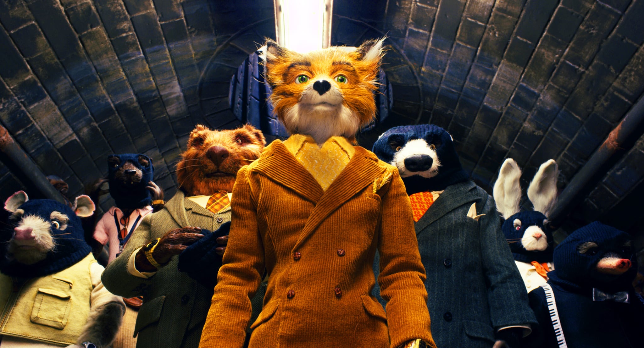
- Fantastic Mr. Fox (2009) uses literal warm orange tones as all of the characters are lit with lava lamps, while cold tunnels are dark, and unnatural.
- The Grand Budapest Hotel (2014) uses colors, bright red and purple, to represent the hotel at the height of its fame, only to visibly fade after the last days.
4. Long Takes
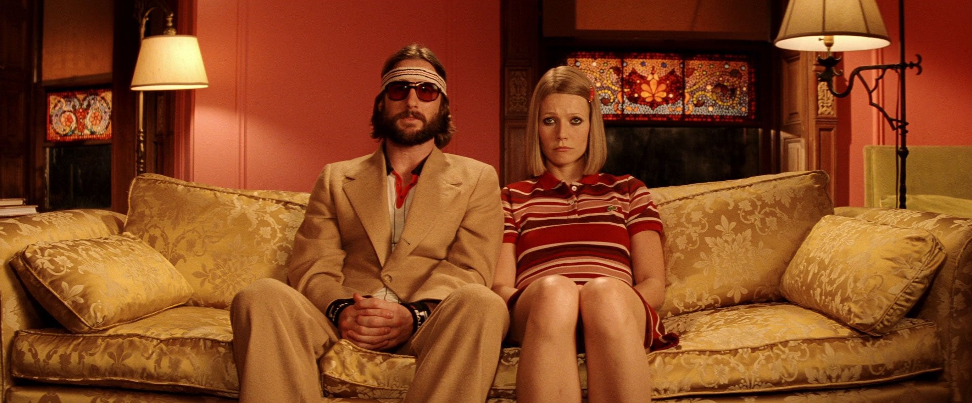
Anderson loves long and unbroken shots with smooth tracking camera moves or whip-pan movements of the camera. This gives his films a rhythmical quality and a sense of connection between characters and the audience. The use of this rhythm can be disrupted, as in the chase scene in The Royal Tenenbaums (2001), a shot full of chaos and contrast.
5. Recurring Themes
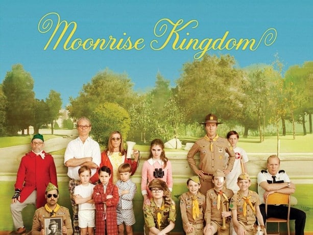
Anderson's dry dialogue is understated, sustaining comedy with emotions. With his precise visual composition, Anderson creates a world that is whimsical and deeply human. Films such as Moonrise Kingdom (2012) and Fantastic Mr. Fox (2009) shows that growing up never really ends.
6. Storytelling
Anderson’s films are aware of storytelling itself. They do not hide that you are watching a film. These are notable examples:
- Moonrise Kingdom (2012) makes use of a narrator who engages the audience directly.
- Rushmore (1998) divides scenes with curtains similar to those on stage.
- The Darjeeling Limited (2007) follows a character who appears to be writing the story actively.
Part 3. Why Filmmakers and Photographers Love His Style
Each color in Anderson's films signifies something, and conveys a feeling:
- Warm yellows and golds (Moonrise Kingdom): nostalgia, youth, adventure.
- Soft pinks and pastels (The Grand Budapest Hotel): whimsy, innocence, charm.
- Earthy oranges and browns (Fantastic Mr. Fox): nature, warmth, comfort.
- Muted blues and greys (The Royal Tenenbaums): sadness, distance, memory.
- Faded blues (The Life Aquatic): loneliness, lost dreams.
Some reviewers label his aesthetic, "too polished." Others in creative fields know his work as "visual poetry." His colors are not merely decorative. Color complements the narrative. Filmmakers and photographers are inspired by this way of thinking about color, because color:
- Provides a guidance of emotion, so the audience can feel the story.
- Interjects meaning, to what is often more than meets the eye.
- Creates an identity, where all of Anderson's work is unforgettable.
Part 4. How to Achieve Wes Anderson Color Grading (Step-by-Step)
Would you like to mimic Wes Anderson's color grading style? There are two simple ways to replicate his desired color grade on your desktop computer, or online.
1. Premiere Pro
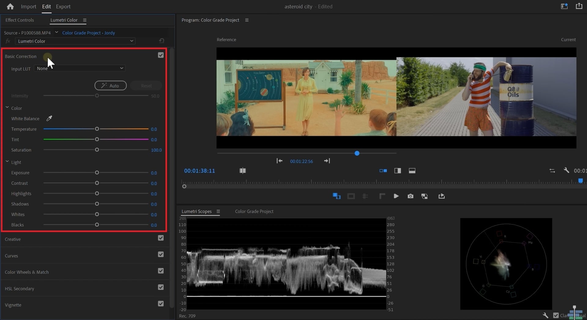
Premiere Pro's color workspace is ideal for a simple and rapid color grading. This makes the task of editing and achieving Wes Anderson's film look easy. Most of the work will be done in the Lumetri Color panel. The panel has sliders that allow the user to set exposure, contrast, highlights, shadows, whites, and blacks easily, and with precision.
Here are the instructions:
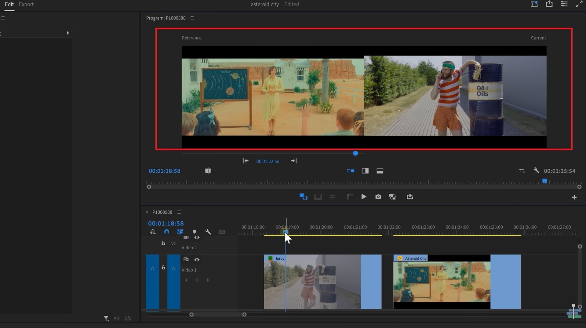
Step 1: Import your footage, along with some reference footage of Wes Anderson. Use the Comparison View so you can see the two clips side-by-side for exact matching.
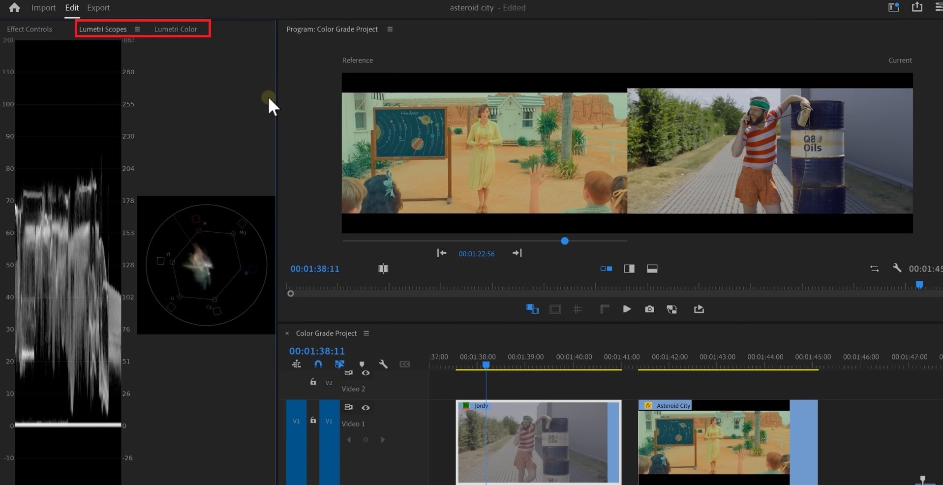
Step 2: Use the Lumetri Color panel to adjust color, and open the Lumetri Scopes panel to view exposure and color in your clip.
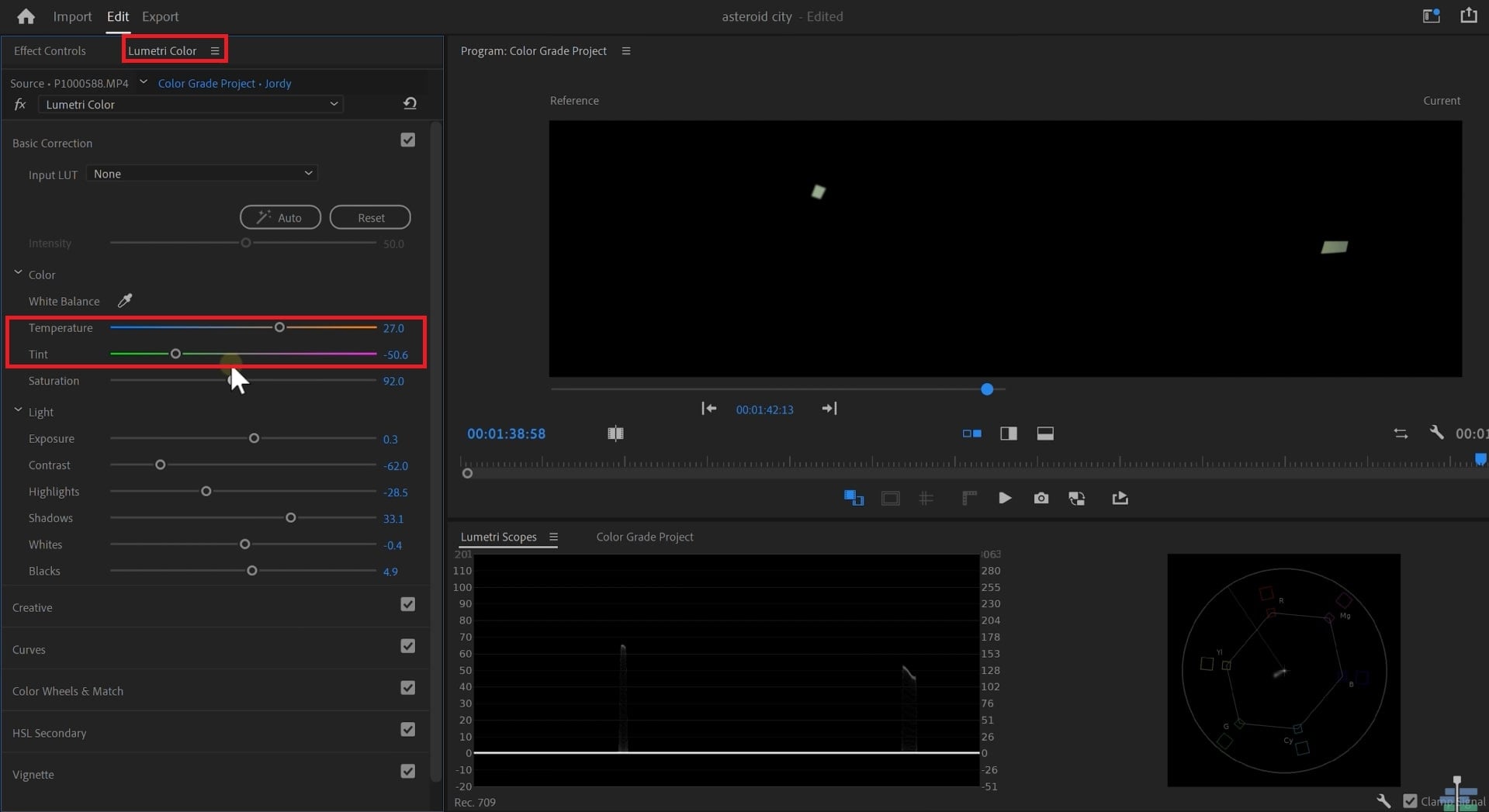
Step 3: In the Basic Correction tab, start by adjusting the Exposure, Contrast, Highlights, Shadows, Whites and Blacks until they look similar to the reference clip. In the Asteroid City, you will notice that the contrast is a little flat and low contrasted. So, adjust accordingly.
Step 4: Once you have the clips looking similar enough, switch to the Vector Scope. The idea now is to identify the direction and saturation of color, so go and mask out a white object present in both videos. From here, adjust the Temperature and Tint sliders until visually they look as close as you can get, then use the scopes again to compare both videos.
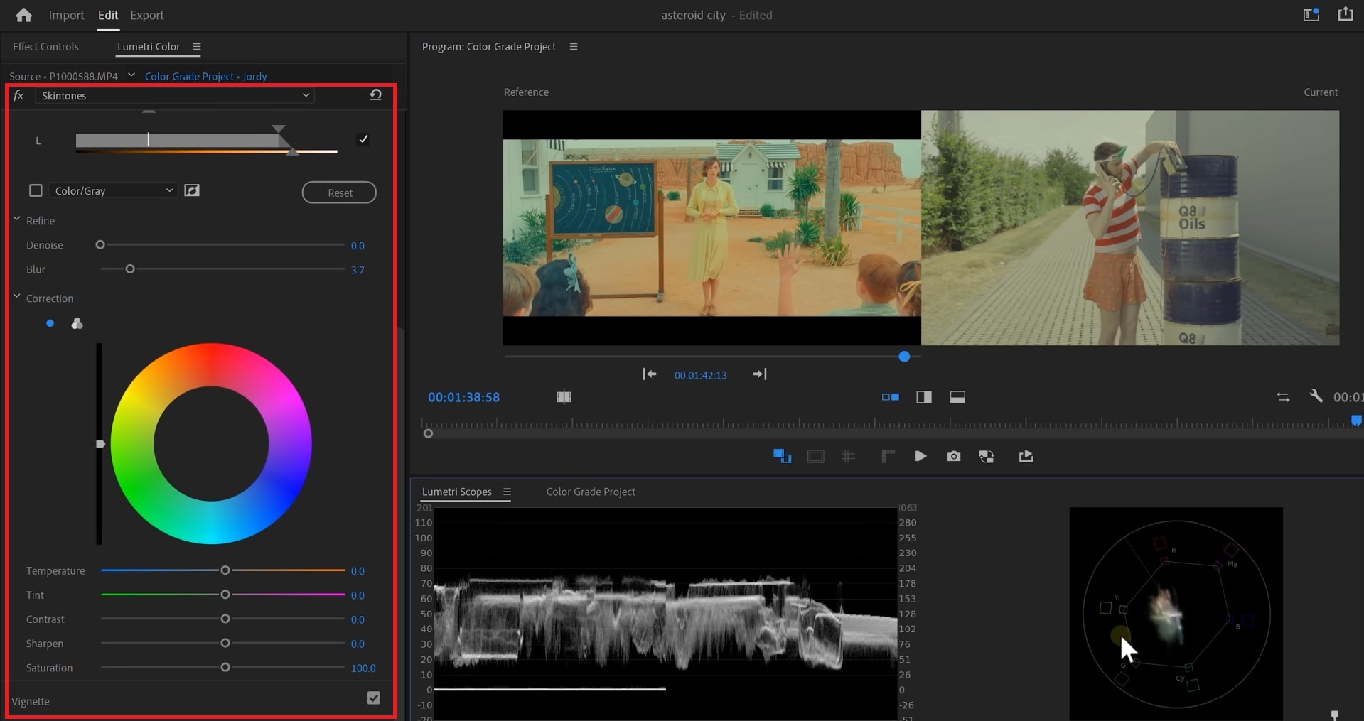
Step 5: Insert a new Lumetri effect and rename it Skin Tone. In HSL Secondary, select the skin region. Adjust Hue, Saturation, and Lightness. Soften with Denoise and Blur. Change the Tint, Exposure, and Color Wheels until the tones match. Repeat this for any other important colors when needed.
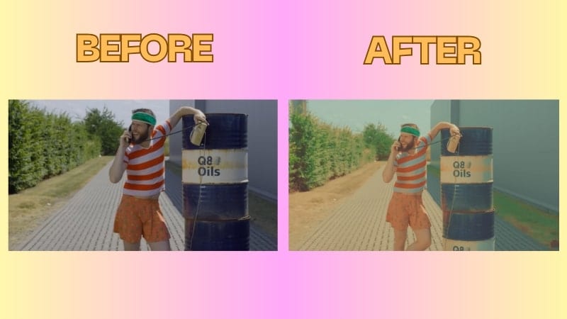
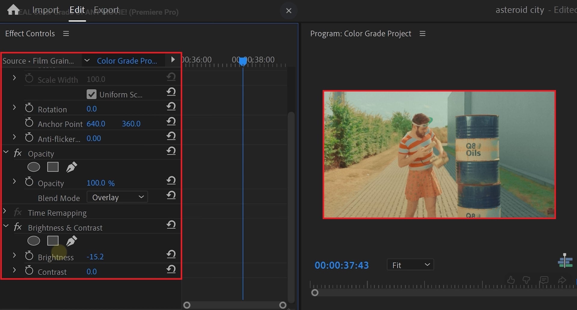
Step 6: To replicate the film look of Asteroid City, add a Film Grain Overlay from Storyblocks. Set the Blending Mode to Screen, and make minor adjustments to the Contrast to enhance the effect. Finally, implement the Faded Film look to remove much of the high contrast, for warmth in a typical cinematic look.
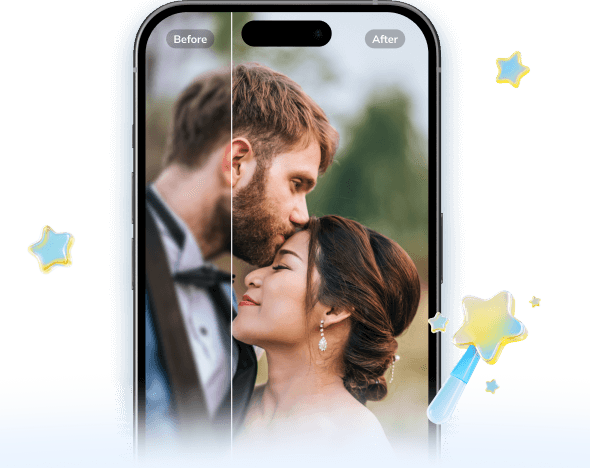
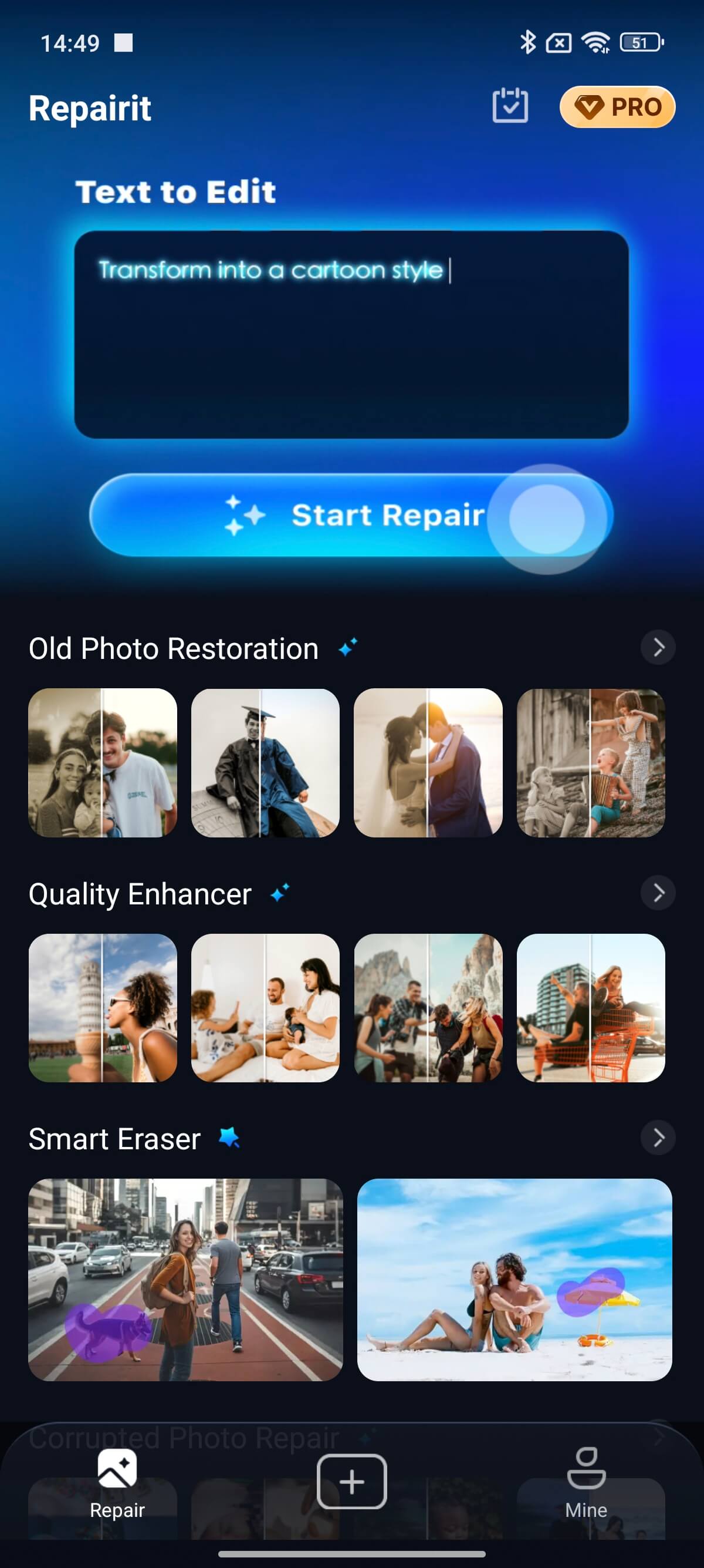
2. Repairit App
If you’ve ever dreamed of achieving the iconic Wes Anderson color grading aesthetic — pastel tones, perfect symmetry, and a nostalgic cinematic glow — the Repairit App makes it possible in just a few taps.
This all-in-one AI photo tool lets you restore, recolor, and stylize your photos to capture that signature storybook warmth and visual harmony Wes Anderson is famous for.
Using the app’s AI Text-to-Edit feature, you can simply type prompts like "apply Wes Anderson-style color palette," "soft pastel tones with cinematic contrast," or "vintage film warmth with clean symmetry."
Within seconds, the AI analyzes your image and transforms it into a balanced, cinematic composition with natural lighting, muted highlights, and color precision that feels straight out of The Grand Budapest Hotel.
Key Features:
🎨 AI Wes Anderson Color Grading: Automatically apply soft pastel hues, warm lighting, and subtle contrast to create the signature cinematic tone.
✨ Text-to-Edit Prompts: Describe your desired look in words — e.g., "vintage Wes Anderson palette" — and AI adjusts lighting, tone, and balance instantly.
🔍 Sharpen and Enhance Details: Clean up blurred edges and improve symmetry for that precise, filmic composition.
🖼️ Creative Transformations: Convert photos into artistic or cartoon-like compositions while maintaining tonal harmony.
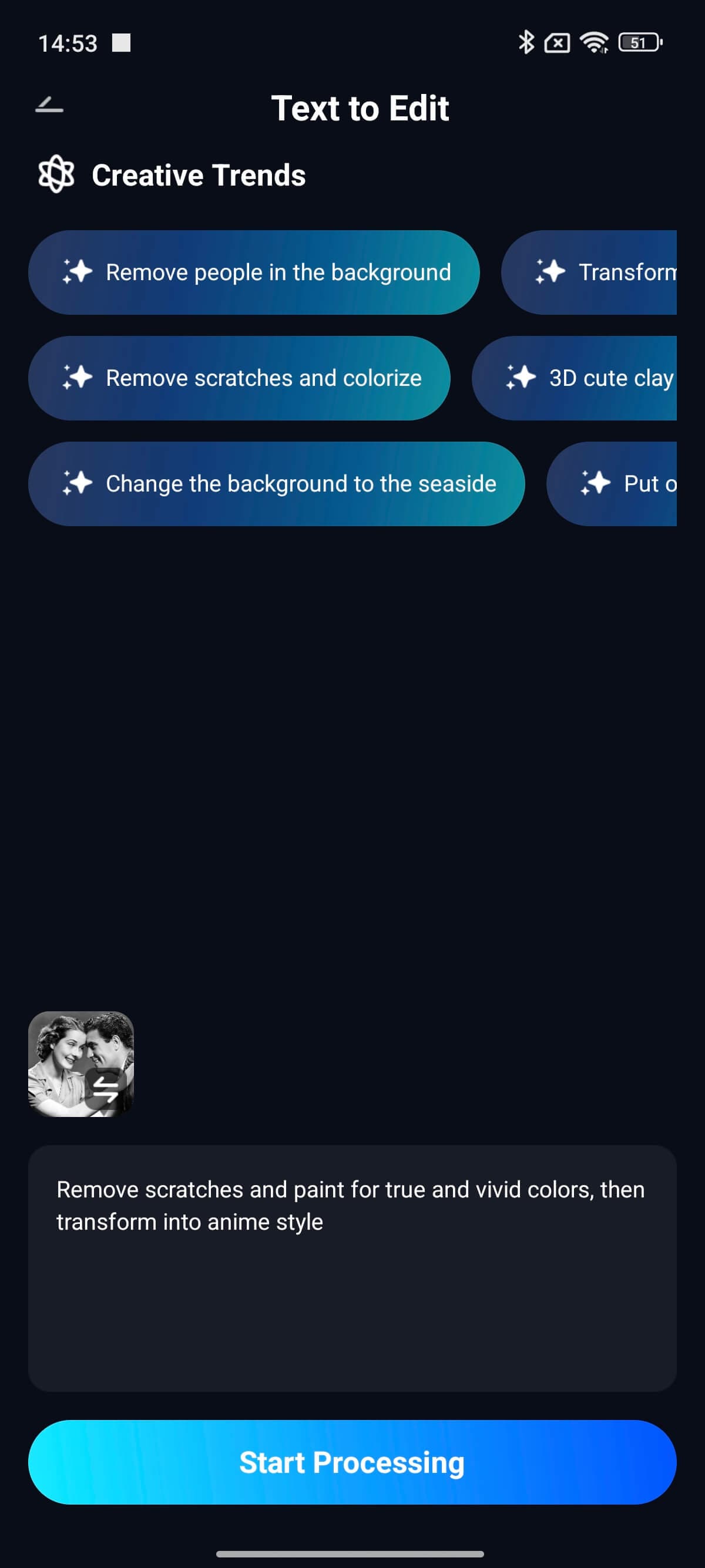
Step-by-Step Guide:
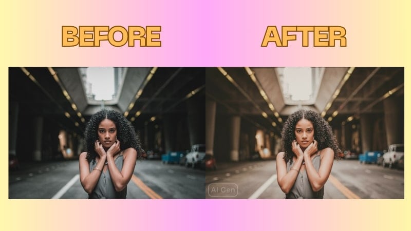
Step 1: Open the Repairit App and select Text to Edit. Then upload the photo you wish to convert to the Wes Anderson style.
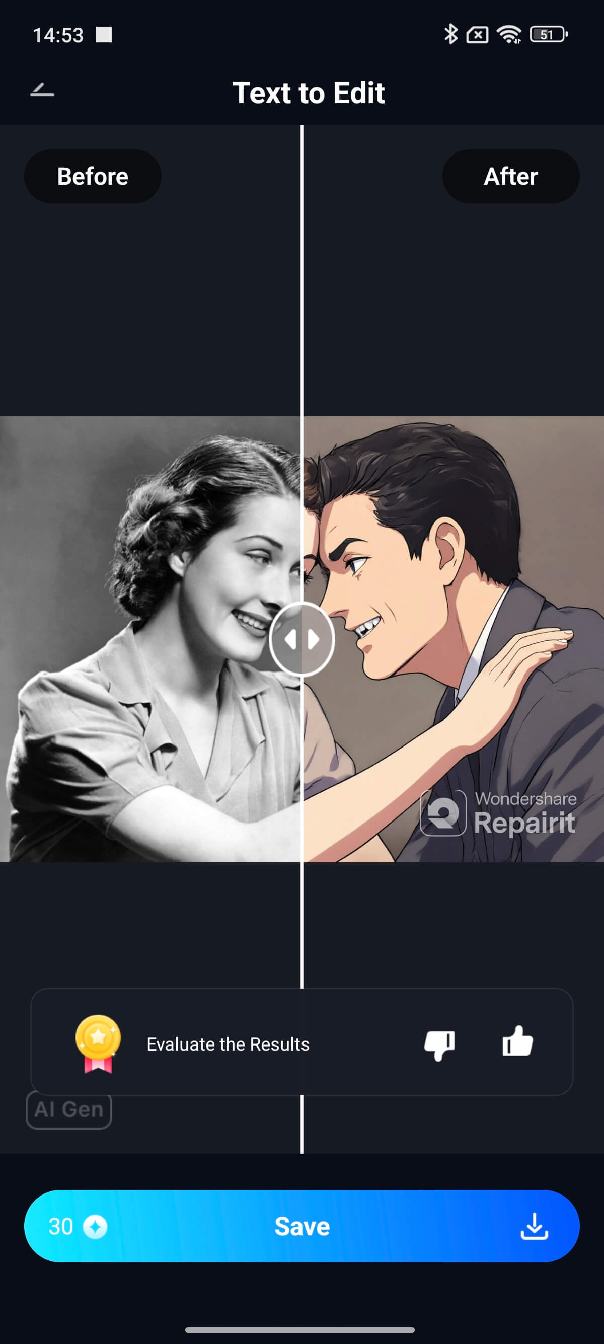
Step 2: Choose from existing AI prompts or type in your own command. Tap Start Processing and the AI will automatically convert your photo into a new photo in the Wes Anderson style.
Step 3: Preview the image, see what the original photo looked like, and tap Save once you are happy.
Part 5. Tips for Filmmakers & Photographers Inspired by Wes Anderson
Inspired by Wes Anderson color grading? Here's some simple ways to create it in your color palette.
- Select 3-5 colors for your color scheme. Choose colors that will remain constant in every one of your scenes to create and regulate the mood and identity of your project, as Anderson does with his projects.
- Choose colors that complement each other. Use balancing colors to create cinematic and focusing imagery.
- Use LUTs to establish the same consistent color paletted in tone in every scene. This way continuous colors will unify your imagery and its emotional context.
- Use colors that aren't bright or harsh. Instead, use soft colors with a hint of vintage warmth in order to create an evergreen dreaminess and nostalgia similar to Anderson's style.
- Let color indicate your emotional feelings. For example, use bright color for hope, cool color for calm; muted for nostalgia; and so on. When used correctly, these cues can help you build the story together through color.
Conclusion
We’ve seen in Anderson’s films that color is one of the strongest visual storytelling tools used in cinema. He utilizes energetic colors, strong contrasts, and purposeful color palette not only to create beautiful imagery. They also reveal the emotional context of the scene, giving meaning to every frame. Try using the Premiere Pro editing application (desktop tool) and the Repairit App to achieve this color style.
FAQs
-
What color palette does Wes Anderson typically use when color grading?
Wes Anderson works in soft pastel colors such as pink, yellow, blue and green. These soft shades create a nostalgic and whimsical feeling which makes them distinct. -
Can someone who is a beginner recreate the Wes Anderson color profile in free tools?
Yes. You can achieve a similar profile using free or simple tools such as DaVinci Resolve or Premiere Pro's trial version. Drop the saturation, balance the tones, then add a pastel filter and you are off to the completion of that Wes Anderson beautiful effect. -
What is the emotional effect of pastel tones on your photos and videos?
Pastel tones help add soft, dreamy, and nostalgic feelings to the visual. They give the scenes warmth and create inviting visuals, which allows you to focus on the calm and emotional parts of the story without too much distraction.